
Brand Identity & Packaging
Go all in. Hex does the rest.
.jpeg)
The brief
Hex came to Shotlist as a concept: a pre-workout, and eventually a full line of athletic supplements, for guys in their 20s who want a good physique without giving up having fun. The brand carries a bit of an edge to it.
The insight
The audience wasn't gym purists chasing discipline for its own sake. They're guys who care about living well, training hard but still enjoying life outside the gym. They're skeptical of supplement brands that lean on vague claims, and they want a product that proves its effects instead of just talking about them.
The idea
Go all in, Hex does the rest. Every jar carries the same mantra: "Balance kills the thrill. We are the antidote to moderation." The identity is built to match: an engineered, no-compromise formula wrapped in a system with the same conviction as the product inside it.
The system
Logo
An angular mark that doesn't apologize for itself
The wordmark's sharp, faceted cuts carry the same forward motion as the brand's go-all-in ethos, nothing rounded, nothing soft.

Dark

Light
Color
Clinical precision, dialed up to chaos
White Ivory keeps the label credible and easy to read; Mystic Indigo and Midnight Abyss carry the intensity, reserved for the moments the brand is really about.
White Ivory
#F6F3EC
Mystic Indigo
#3A08A6
Midnight Abyss
#0C0826
Typography
Two typefaces, one attitude
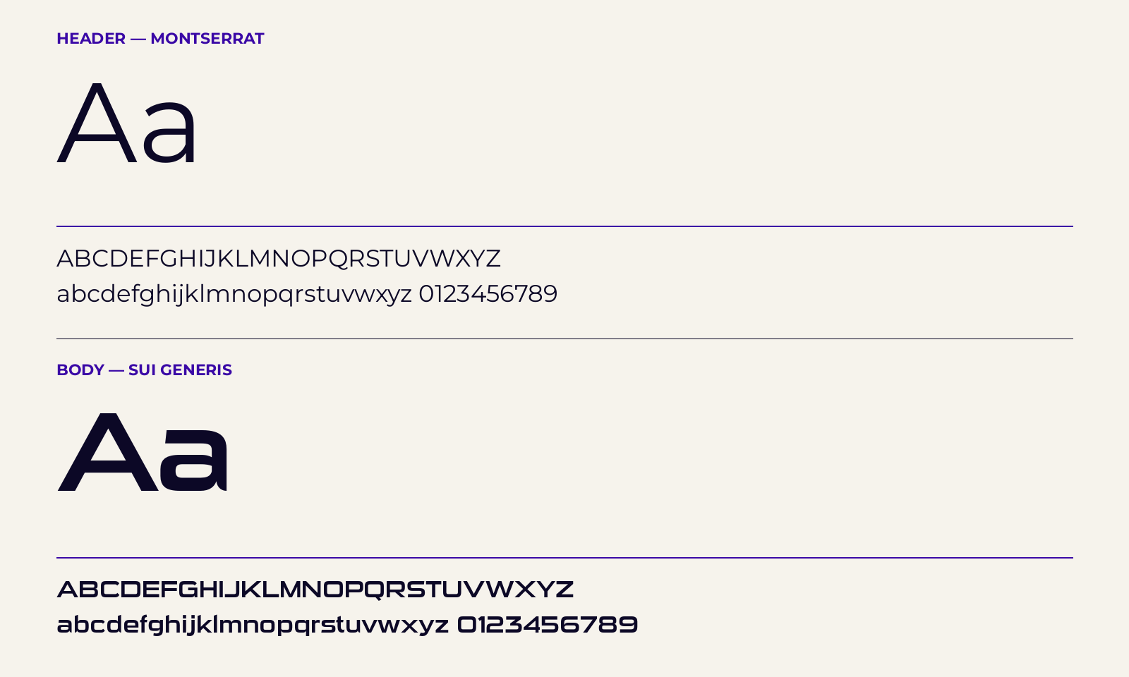
Montserrat carries the header text on the label with clean, no-nonsense clarity; Sui Generis handles the body copy, its squared-off, engineered character keeping dosages and claims legible without softening the brand's edge.
Packaging & application
A label system built for the shelf and the gym bag
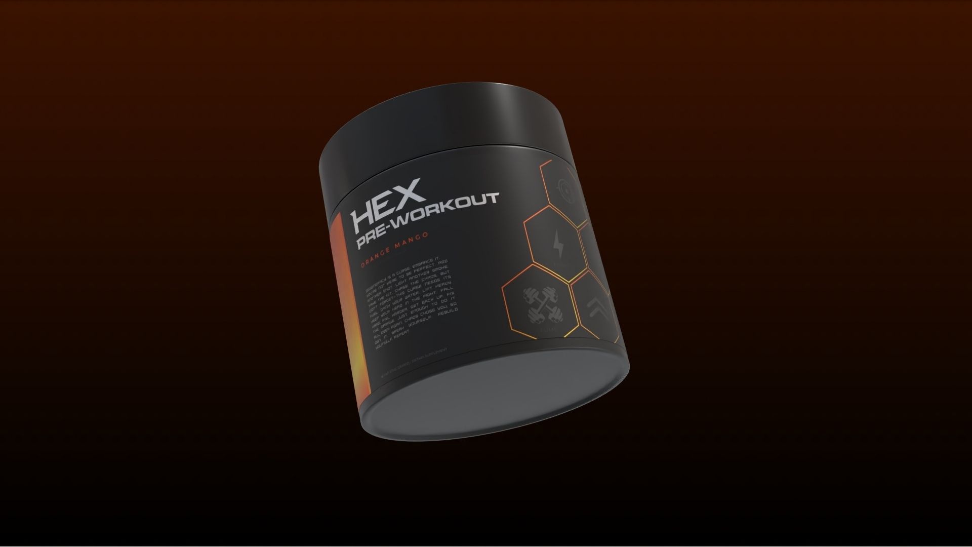
From label architecture to mockups and social assets, every touchpoint carries the same palette and typographic system so the brand reads consistently whether it's on a jar, a story post, or a product page.

.jpeg)
.jpeg)
Where it landed
Hex launched with a complete identity system, logo, color, typography, and packaging, built to scale as the product line grows beyond pre-workout into a full stack of athletic supplements.
https://hexsupps.com/
Let's Build Together
We love teaming up with forward-thinkers who aren’t afraid of breaking out of the mold. If that’s you, let’s connect.

About Shotlist
We create brands that stand out in culture – not just on paper. We blend strategy, design, and storytelling to build brands that leave a lasting impact.