
Work · Web design & Development
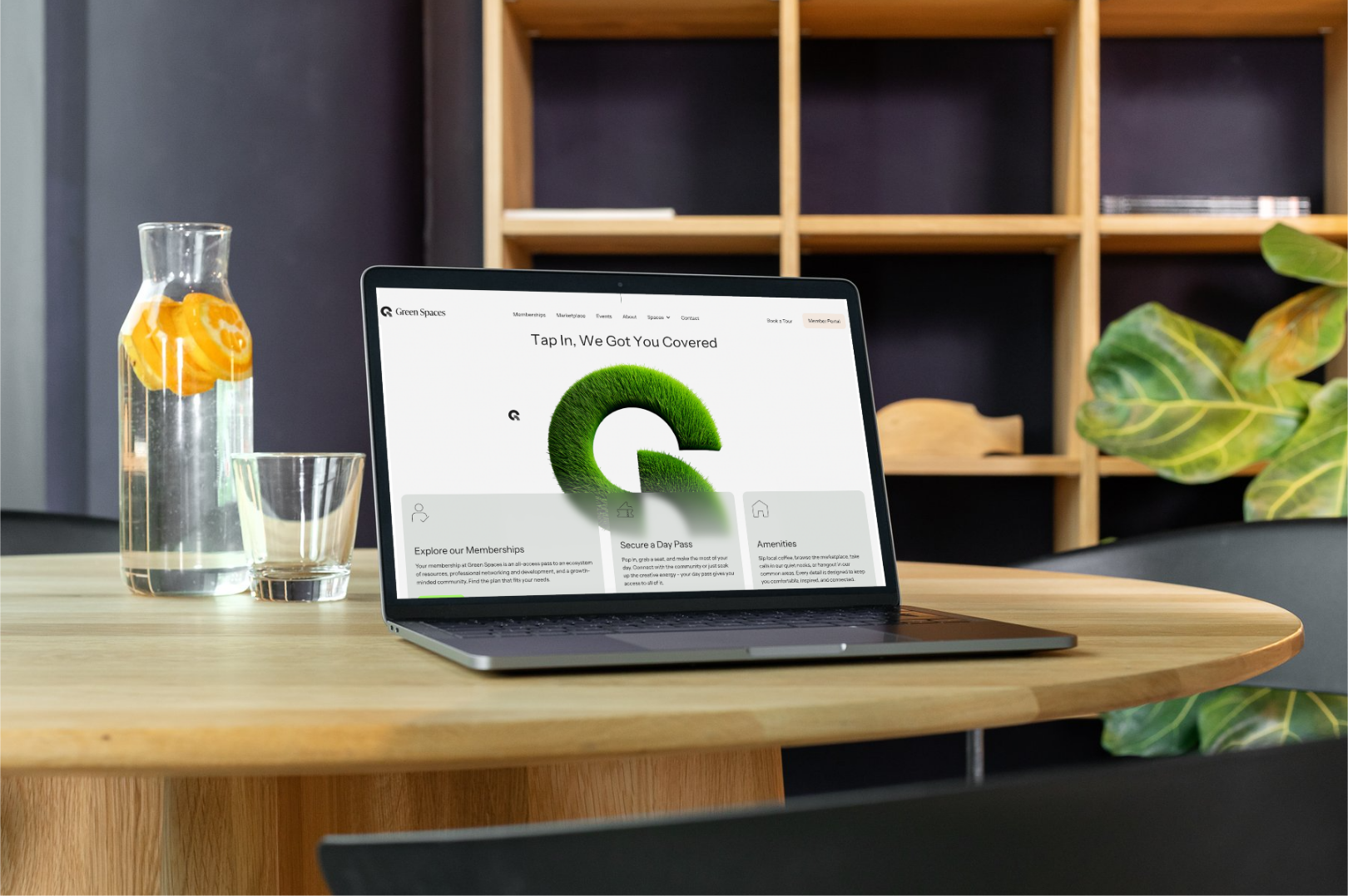
A site that sells the community, not the square footage.
The situation
What wasn't working
Green Spaces built a coworking community around sustainability and shared purpose, but their site didn't say any of that. The offerings were scattered across pages that didn't reflect how members actually used the space, and the design read more like a directory than an invitation.
That gap mattered because Green Spaces sells community, not square footage. A generic site undercut the one thing they were actually selling, and made it harder for new members and partners to see what made the space worth joining.
Objectives
What success needed to look like
01
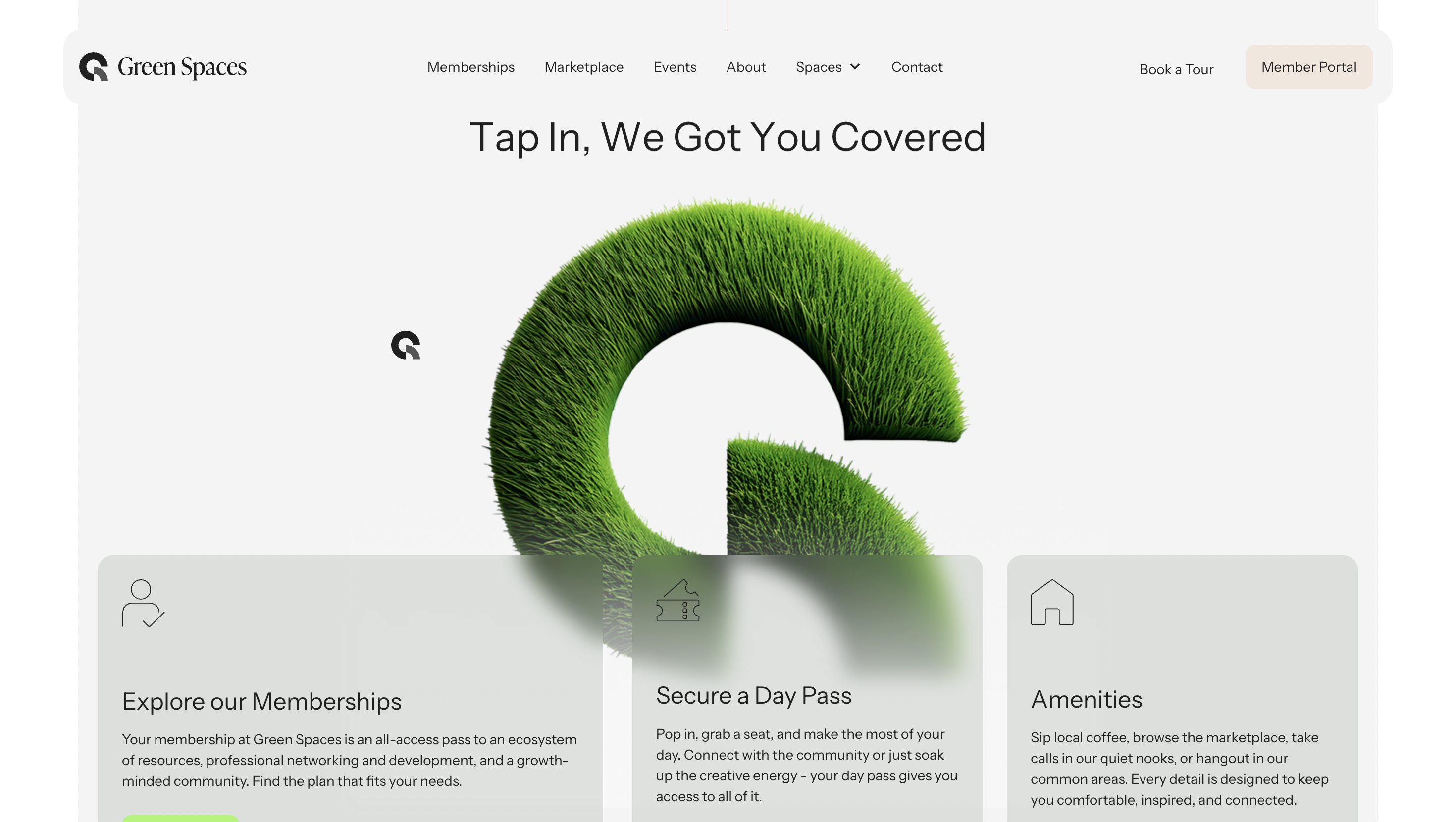
Make it immediately clear what Green Spaces offers, and to whom.
02
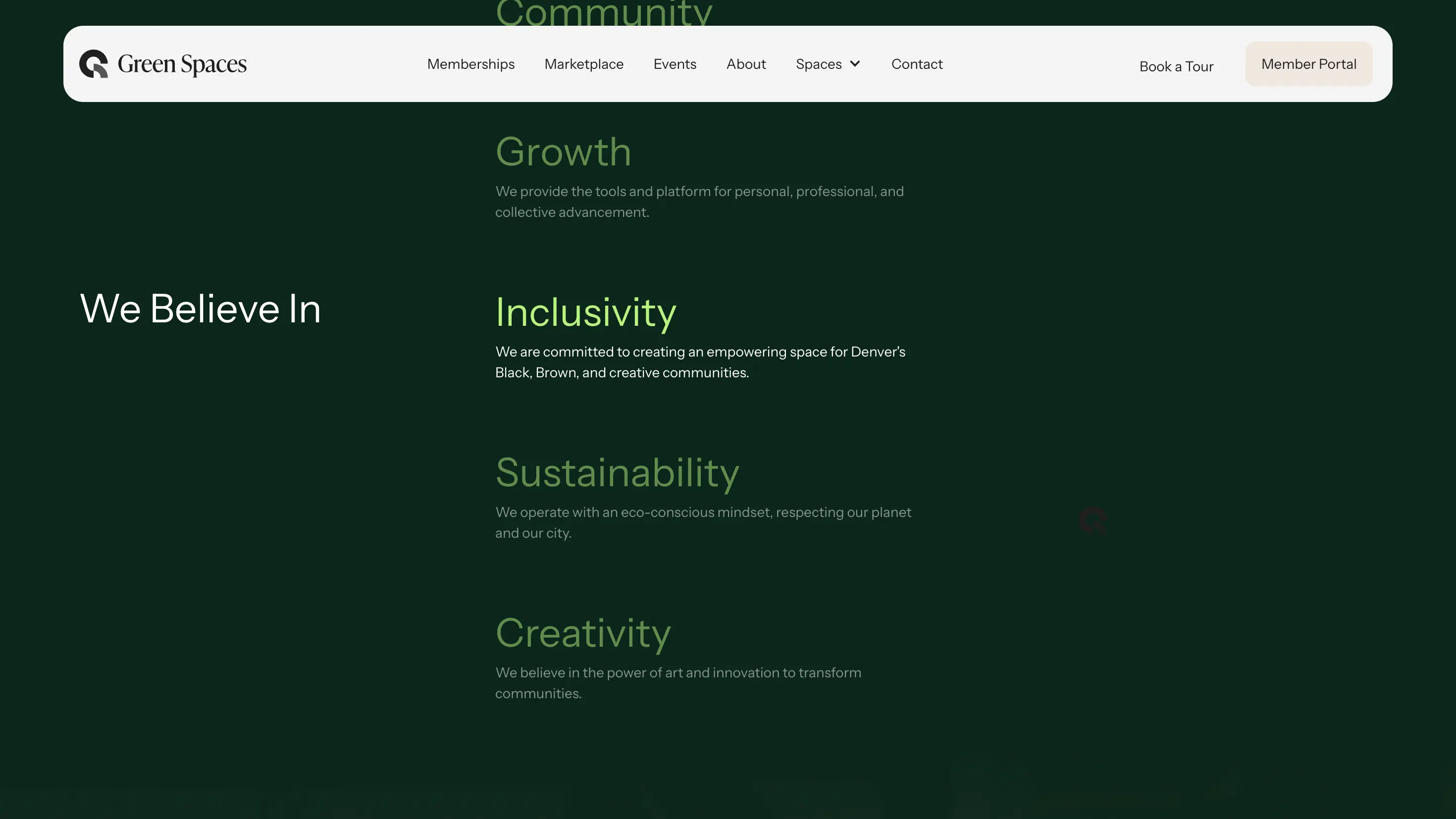
Carry the sustainability and community feel of the physical space onto the screen.
03
Shorten the path from browsing to booking a tour or joining.
04
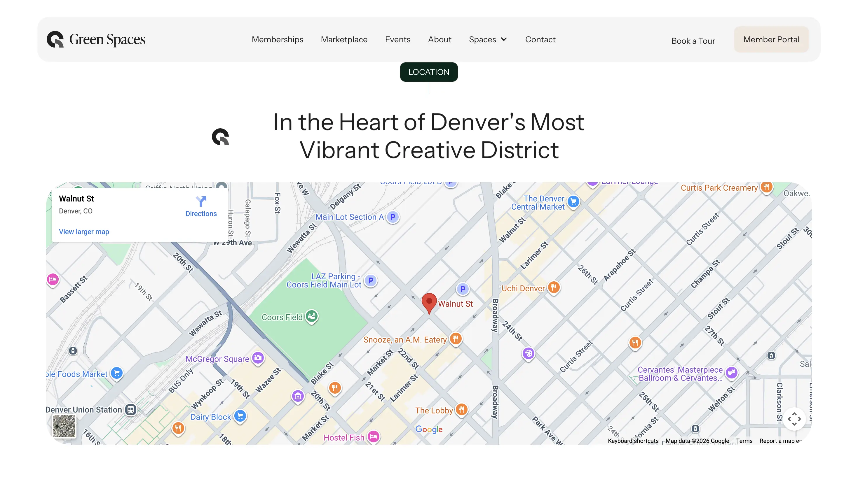
Build on a platform flexible enough to grow with new locations.
Execution
Homepage & brand story
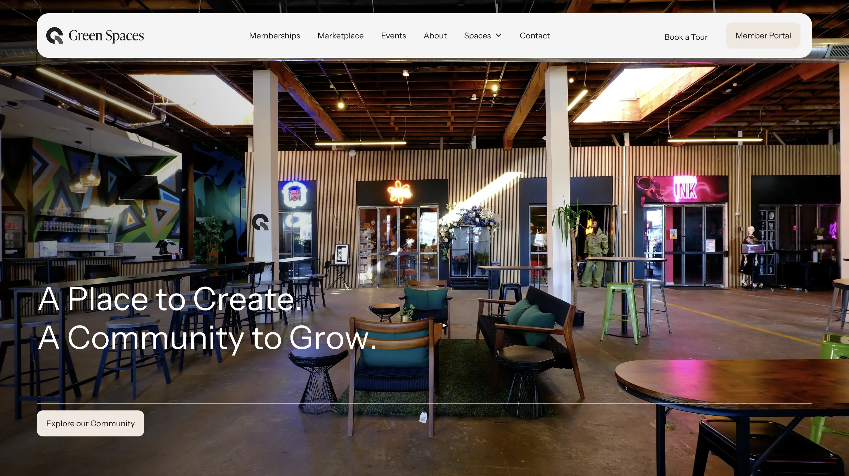
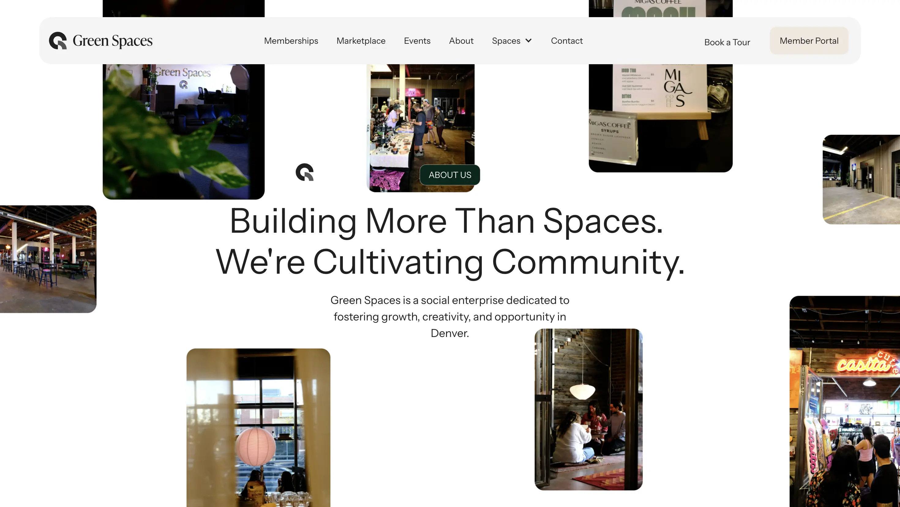
A full-bleed opening that leads with the space itself, not a stock photo of a laptop.
Membership & spaces
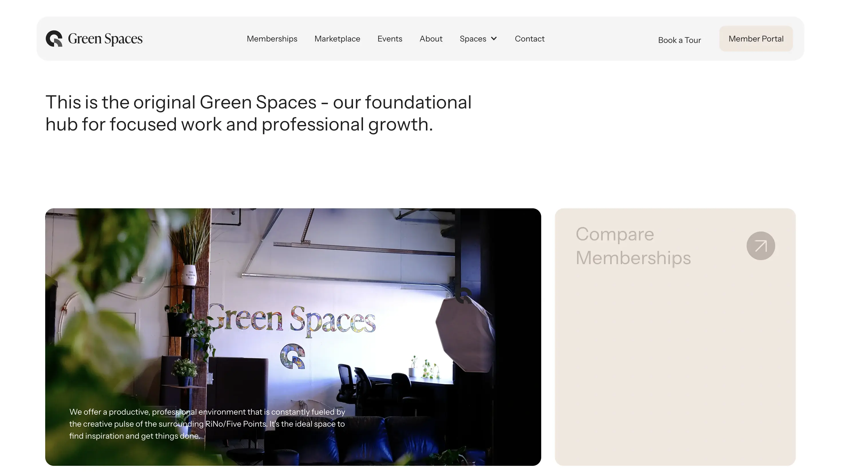
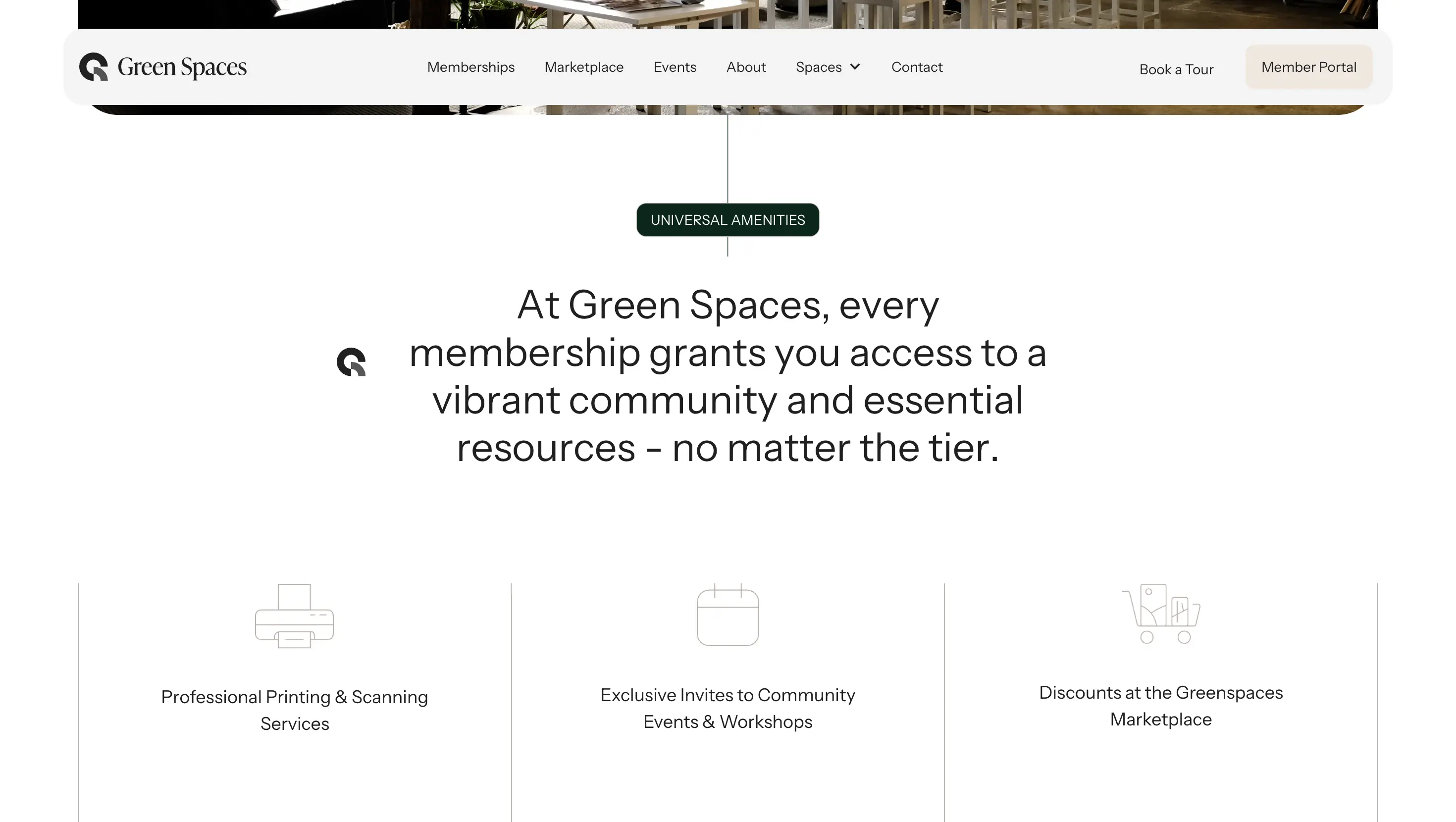
Clear, comparable plans so a prospective member can self-qualify before they ever call.
Community & events
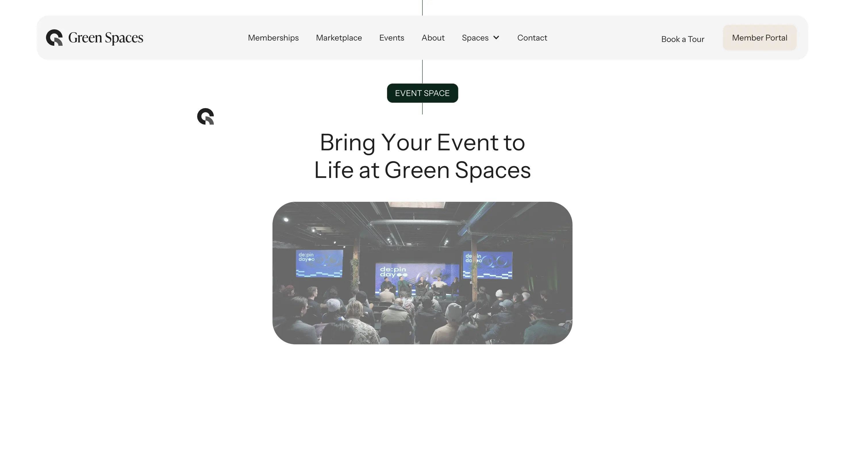
Programming surfaced on the homepage, not buried three clicks deep.
Impact
Jan 2026
Relaunched, built to scale to new locations without a rebuild.
Membership inquiries now route straight through the booking flow, not email back and forth.