
Brand Identity & Packaging
Ascension, built into the routine.
The brief
Throne came to Shotlist before the brand existed - just an idea for a luxury skincare and wellness brand that felt aspirational, with nothing built out yet: no name in the market, no visual language, no product line to point to.
The insight
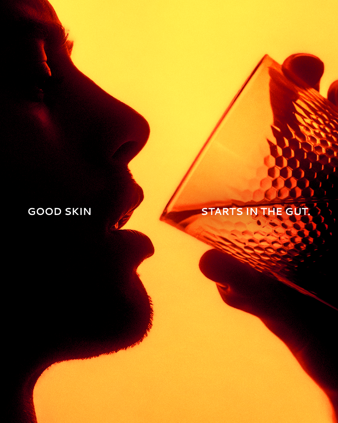
The target wasn't skincare shoppers in general - it was men 20 to 40 who wanted to level up consistently: their health, their complexion, their standards. They didn't want a routine that felt clinical or accidental. They wanted one that felt deliberate.
The idea
Ascension through consistency: identity and packaging built around the idea that leveling up isn't one win, it's a daily coronation.
The system
Logo
Built for the daily ritual, not just the shelf
The wordmark stays legible at label scale and reads with quiet authority - shown positive on light packaging and reversed on dark, the two ways it lives across the line.

Dark

Light
Color
A palette built on restraint
Black, white, and one warm orange accent. Nothing decorative, nothing extra.
Black
#000000
White
#ffffff
Orange
#DD4D1B
Typography
One typeface, used with intention
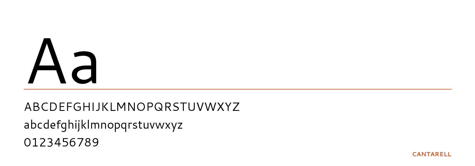
Cantarell carries the entire system - headlines, labels, packaging copy - so the brand reads as one voice everywhere it shows up.
Packaging & application
A system built to scale with the line
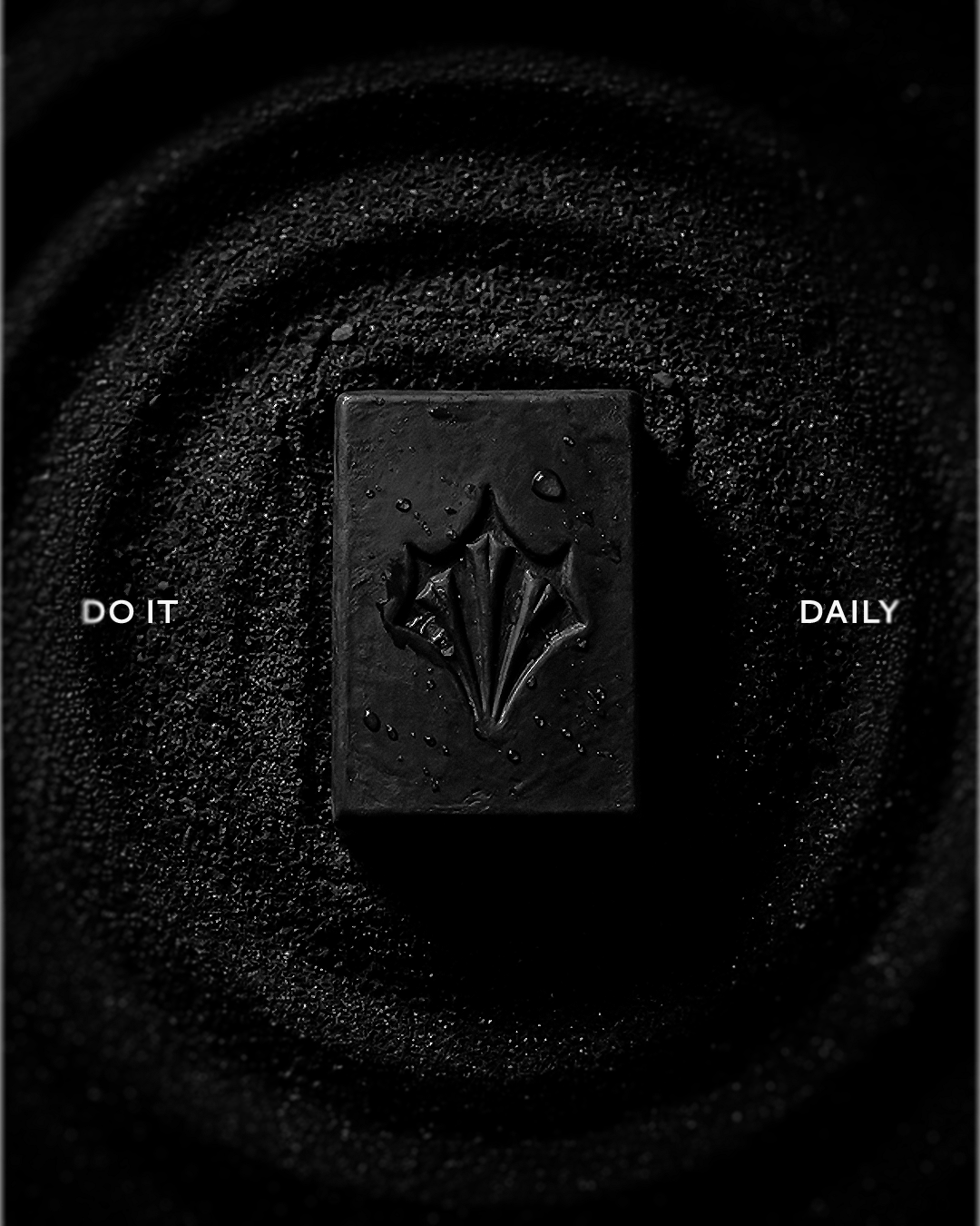
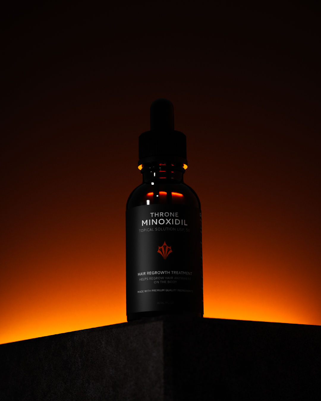
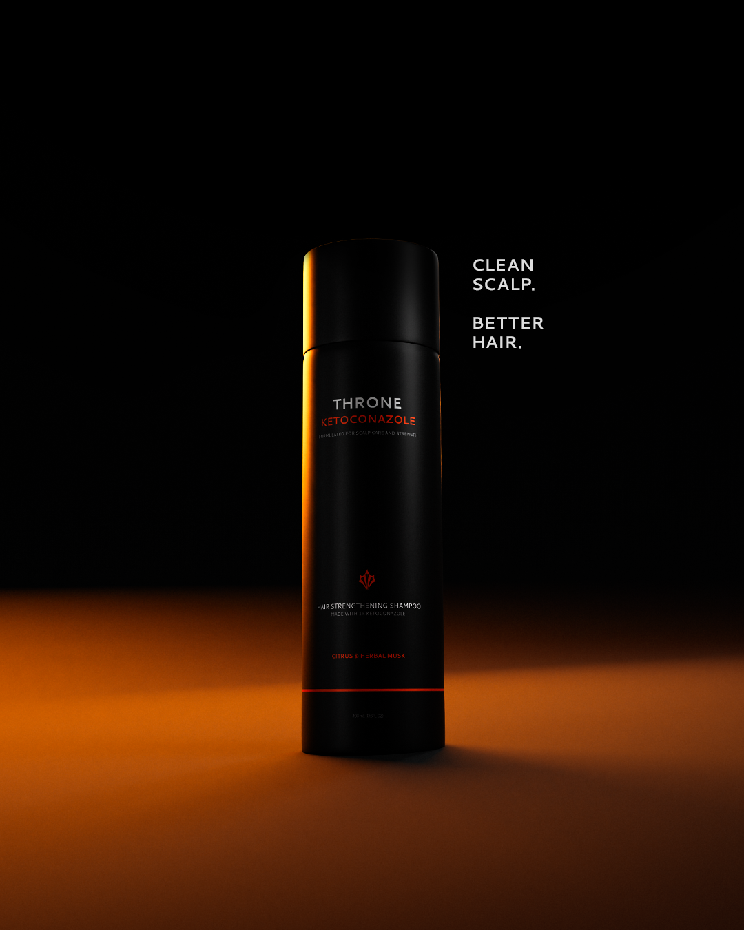
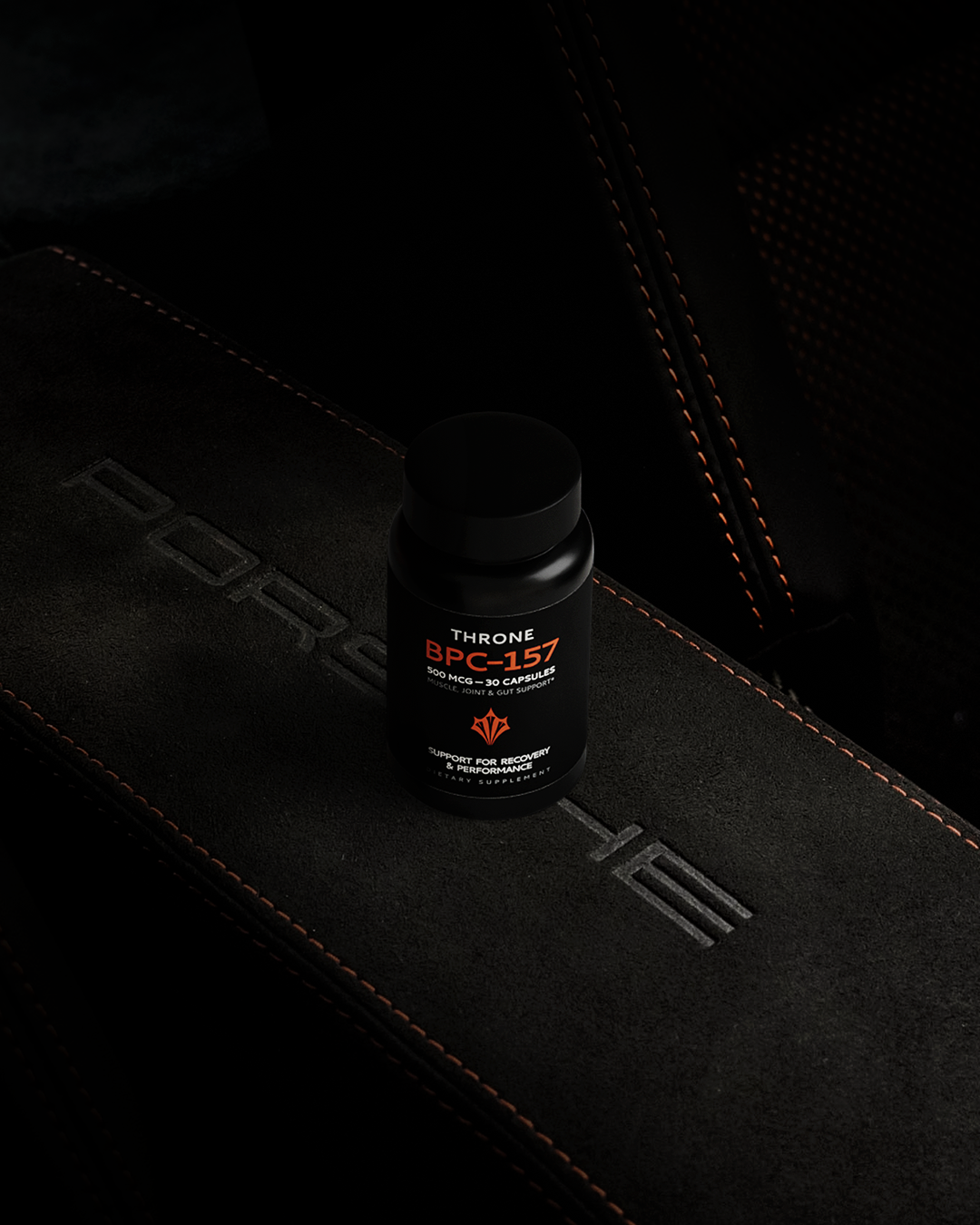
From label architecture to mockups, social assets, and visual collateral, every touchpoint pulls from the same system so the brand feels considered at every size.
Where it landed
Throne launched with a complete identity system - logo, color, typography, packaging, and a full library of social and marketing assets - ready to scale as the product line grows.
https://www.madebythrone.com
Let's Build Together
We love teaming up with forward-thinkers who aren’t afraid of breaking out of the mold. If that’s you, let’s connect.

About Shotlist
We create brands that stand out in culture – not just on paper. We blend strategy, design, and storytelling to build brands that leave a lasting impact.